Pretty vs Usable
A dumb dichotomy debate
September 12, 2020
Edit PostBeautiful is Best?
A phenomenon most of us are familiar with, even if we don’t know it by name:
good looking people have an unfair advantage in life.
The beauty premium phenomenon states that we expect good-looking people to be “better, smarter, more successful, more important, and more valuable.”
Likewise, in 1995 when researchers were studying ATM UIs, they noticed that people expected more of and were more forgiving of good-looking interfaces.
Sound familiar?
If you replace “UIs” with “people”, you basically have what the researchers discovered—the aesthetic-usability effect. It states that we have a tendency to perceive attractive UIs as more usable and expect that they’ll work better—even if that isn’t true.
Rationalizing Pretty
It seems almost every UX designer (including yours truly) has cited this aesthetic-usability effect at one point or another to justify a design decision that makes the design better-looking at the expense of usability or clarity.
And you know what? They’re almost always wrong.
Michal Malewicz says it best in his tell it like it is article:
“UX has a hole in it. It’s called UI and it’s quite bad. This is often because a large part of “UX Designers” can’t design. There. I said it.”
It takes some skill to make a design pretty, but it takes a lot more skill to make a design pretty and usable.
The majority of job postings ask UX designers to do both UX & UI design, despite most not being remotely qualified to do both.
Not that I believe we should only have specialists—quite the contrary. But I don’t believe we should expect designers to do something that they haven’t shown they’re capable of doing.
A Dumb Dichotomy
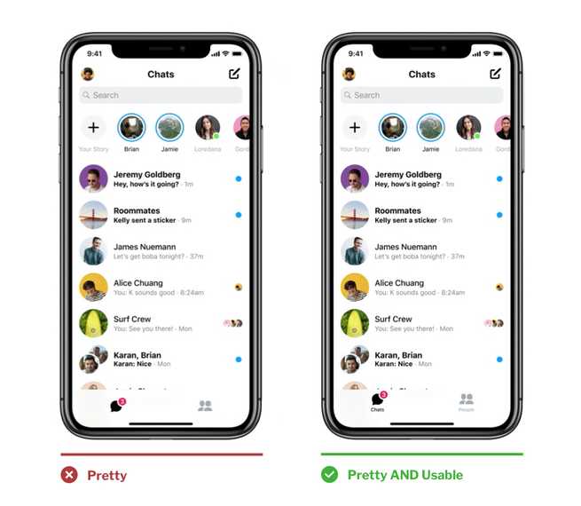
Designers citing this principle in defense of their “pretty” designs like to come up with this dumb dichotomy: either we make it pretty OR we make it usable.

Spoiler: you can make something pretty and usable.

No One Knows What Your Dam Icon Means
Unlabeled icons are probably the number one reason a designer will bring up the aesthetic-usability principle. You can add a label to your dam icon in a way that looks good and people will actually be able to understand that the icon means “dam” and not “bacon dispenser.”
We learned this was a bad idea when Flash became popular (remember mystery meat navigation?), but we seem to keep making the same mistakes over and over.
Unlike art, there’s only one correct design interpretation, and it’s your job as a designer to make that crystal clear.
There are certainly instances where you need to make some tradeoffs on aesthetics to make a design more usable, but if the rest of the UI is designed well, then it’s still going to get the aesthetic-usability effect bump. It just won’t look perfect. But really, how often is anything perfect?
Even good-looking people have a few flaws.
- Prev Post:← 5 ways to make sliding underlined links
- Next Post:Getting into UI/UX →
