5 ways to make sliding underlined links
Bring a little underlined delight to your links
September 12, 2020
Edit PostUnderlined links are as old as the web itself. The underline gives affordance to users that it will link somewhere else. By default, all links are underlined and that’s good enough for a lot of websites.
However, adding a little bit of motion to an underline can create a delightful micro-animation that can help bring your website to life. (did I buzzword right?)
Recreating the underline

Before we dive into the underline transitions, first we need to re-create the native anchor underline.
To get started, we’ll add color to the link to help denote that it’s a link and we’ll get rid of the native underline so we can set our own.
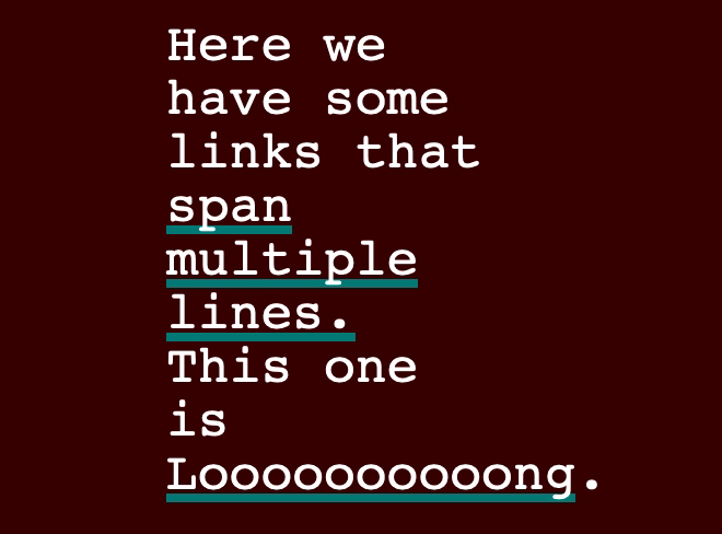
a { color: saddlebrown; text-decoration: none;}From here, we could use an absolutely positioned pseudo-element (i.e. ::before) to achieve the same effect we want. However, absolute positioning will only display an underline on a single line, so I can’t recommend going that route unless you’re using this for something that you’re confident won’t ever be more than a single line.
So the only other option for creating a multi-line underline is using the background property. Since you can’t change the size or positioning of background-color, we need to use background-image. I repeat the same color in the gradient as I’m trying to make the background a solid color, but you can definitely spice things up by making it a real gradient.
a { color: saddlebrown; text-decoration: none; background-image: linear-gradient(#d99a5a, #d99a5a);}With the gradient set, it will make the entire anchor’s background to the color/gradient we specify, so we’ll need to change its size and position to make it look like an underline.
We’ll set the background-size’s width to 100% and the height to 0.1em—we use an em here as it will proportionally scale the underline if the text size changes.
Set background-position-y to 100% to place the underline to the bottom of the anchor, making it look like an underline.
We’ll also throw a transition in there so we can animate our underlines later.
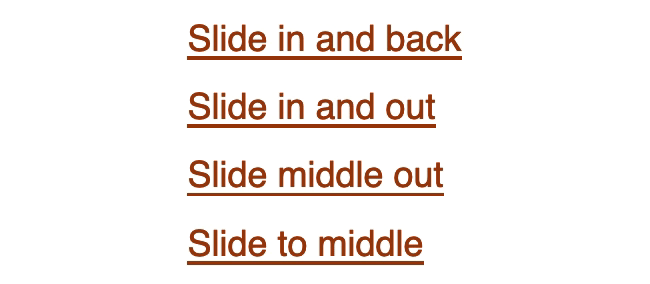
a { color: saddlebrown; text-decoration: none; background-image: linear-gradient(#d99a5a, #d99a5a); background-size: 100% 0.1em; background-position-x: 0%; background-position-y: 100%; background-repeat: no-repeat; transition: background-size 0.2s ease-in-out;}1. Slide in and back

With this effect, we’re going to be creating a link that underlines from left to right on hover. When hovered off, the underline will slide back to the left and disappear.
We set the background-size width to 0% initially to hide it. On hover, we change it to 100% to get it to slide from left to right.
If you want to reverse the direction, change background-position-x to 100% to change the starting position to the right.
a { color: saddlebrown; text-decoration: none; background-image: linear-gradient(#d99a5a, #d99a5a); background-size: 0% 0.1em; background-position-y: 100%; background-position-x: 0%; background-repeat: no-repeat; transition: background-size 0.2s ease-in-out;}
a:hover,a:focus,a:active { background-size: 100% 0.1em;}2. Slide middle out

When we hover on the link with this effect, the line starts from the middle and extends simultaneously to the right and left edges. On hover-off, the line slides back to the middle and disappears.
The only difference between this one and the previous one is that we change background-position-x to 50% to making the starting point of the underline in the middle.
a { color: saddlebrown; text-decoration: none; background-image: linear-gradient(#d99a5a, #d99a5a); background-size: 0% 0.1em; background-position-y: 100%; background-position-x: 50%; background-repeat: no-repeat; transition: background-size 0.2s ease-in-out;}
a:hover,a:focus,a:active { background-size: 100% 0.1em;}3. Slide in and out

Hovering on a link with this effect looks exactly the same as the first effect. However, on hover-off, the underline will slide off to the right instead of snapping back to the left.
There’s no hover-off pseudo-class in CSS, unfortunately, but there are some CSS tricks to mimic it for certain effects.
We essentially use the same CSS trick, but here we take advantage of the underline not being initially visible. We set background-position-x: 100% with our initial styles so it slides to the right on hover-off and change it to 0% on hover so that the line comes in from the left.
a { color: saddlebrown; text-decoration: none; background-image: linear-gradient(#d99a5a, #d99a5a); background-size: 0% 0.1em; background-position-y: 100%; background-position-x: 100%; background-repeat: no-repeat; transition: background-size 0.2s ease-in-out;}
a:hover,a:focus,a:active { background-size: 100% 0.1em; background-position-x: 0%;}4. Slide to middle

With this effect, we have 2 lines that we start on the outside edges and slide them inwards until they meet in the middle. On hover-off, they slide off to the edges and disappear.
Since we have 2 different lines, we need to create 2 linear-gradients. Anytime you want to add another background property, you must add a comma after each item’s value. However, if the value is identical for both, CSS will just repeat it. This means we don’t have to manually duplicate each background property if it’s going to be the same for each linear-gradient.
Since everything else for the lines are the same, we just need to adjust their positions. We set the first line’s background-position-x to 0% to start it on the left edge and the 2nd to 100% to start it on the right edge.
a { color: saddlebrown; background-image: linear-gradient(#d99a5a, #d99a5a), linear-gradient(#d99a5a, #d99a5a); background-size: 0% 0.1em; background-position-y: 100%; background-position-x: 0%, 100%; background-repeat: no-repeat; transition: background-size 0.2s ease-in-out; text-decoration: none;}
a:hover,a:focus,a:active { background-size: 100% 0.1em;}Always-visible underline variants
If you do want an underline to always be present, you can still use the first four effects. The only difference is we need to add an additional underline using the same linear-gradient effect. Note that for the slide to middle effect, we’ll have to do add a 3rd linear-gradient since that effect already uses 2 of them.
/*// Shared Styles*/a { color: saddlebrown; background-image: linear-gradient(#d99a5a, #d99a5a), linear-gradient(saddlebrown, saddlebrown); background-size: 0% 0.1em, 100% 0.1em; background-position-y: 100%; background-repeat: no-repeat; transition: background-size 0.2s ease-in-out; text-decoration: none;}
/*// Slide in & back*/.slide-in-back { background-position-x: 0%;}
.slide-in-back:hover,.slide-in-back:focus,.slide-in-back:active { background-size: 100% 0.1em, 100% 0.1em;}
/*// Slide in & out*/.slide-in-out { background-position-x: 100%;}
.slide-in-out:hover,.slide-in-out:focus,.slide-in-out:active { background-size: 100% 0.1em, 100% 0.1em; background-position-x: 0%;}
/*// Slide middle out*/.slide-middle-out { background-position-x: 50%;}
.slide-middle-out:hover,.slide-middle-out:focus,.slide-middle-out:active { background-size: 100% 0.1em, 100% 0.1em;}
/*// Slide to middle*/.slide-to-middle { background-image: linear-gradient(#d99a5a, #d99a5a), linear-gradient( #d99a5a, #d99a5a ), linear-gradient(saddlebrown, saddlebrown); background-size: 0% 0.1em, 0% 0.1em, 100% 0.1em; background-position-x: 0%, 100%;}
.slide-to-middle:hover,.slide-to-middle:focus,.slide-to-middle:active { background-size: 100% 0.1em, 100% 0.1em, 100% 0.1em;}5. Slide to top

For this effect, we have an always-visible underline, but on hover, we’ll grow the underline to the top of the anchor.
Since this underline will slide underneath the text, it’s important to make sure you use colors that will pass a contrast checker to ensure good accessibility.
Since we want the underline to always be visible, note that we changed the default background-size’s width to 100%. To slide the underline to the top of the link, we change the background-size’s height to 100%.
a { color: black; background-image: linear-gradient(#d99a5a, #d99a5a); background-size: 100% 0.1em; background-position-y: 100%; background-repeat: no-repeat; transition: background-size 0.2s ease-in-out;}
a:hover,a:focus,a:active { background-size: 100% 100%;}Bonus!
For making it this far, I have a little treat for you. I saw this effect making the rounds on X/Twitter and it’s actually what inspired me to write this post.
@jh3yy created a CodePen where he animates an underline over an existing underline.
Learn how to create this effect on Jhey’s Egghead tutorial.
Got more?
Have a cool underline link effect? I’d love to see it!
Send it to me @NerdCowboy or through my contact page!
- Next Post:Pretty vs Usable →